How to Pick Ribbon That Matches Your Wreath Sign
Here is something I want you to write on a sticky note and put on your craft table: your wreath sign already has your ribbon palette on it.
Every color, every pattern direction, every vibe you need is sitting right there on that sign just waiting for you to notice it. Once you learn to read a sign the way I’m going to show you, ribbon selection goes from the most stressful part of wreath making to the most fun part.
Watch the quick tip below and keep reading for the full breakdown!
The Quick Answer to Matching Ribbon
Find the dominant color in your sign and make that your anchor ribbon. Then pull two or three supporting colors from the sign’s details and find ribbon patterns that match the sign’s overall style. Finish with a neutral ribbon to ground the whole combination. Four ribbons, all reading from the sign, every single time.
The #1 ribbon selection mistake
Shopping for ribbon before you have your sign. When you pick ribbon first, you end up with combinations that are pretty on their own but have no anchor point and no reason to belong together. Start with the sign and let it make the decisions for you.
The Four-Step Method for Reading Your Sign
Find the Dominant Color: Your Anchor Ribbon
Look at your sign and find the color that takes up the most visual space — the background, the main image, or the largest design element. That color becomes your anchor ribbon, and it is always the widest ribbon in your bow. Everything else coordinates with it rather than competing with it.
Example: A lemon sign has a white background with yellow fruit. Yellow is your dominant color. Anchor ribbon: a wide yellow print or a lemon-pattern ribbon.
Step 2: Pull the Secondary Colors: Your Supporting Ribbons
Now look at the sign’s supporting details like the lettering color, the border, the accent elements. Each one is a ribbon. If the sign has three colors, you have three ribbons. Keep the widths varied so all three stay visible when layered in the bow.
Example: A sweet tea sign has brown mugs, white lettering, and a burlap background. Supporting ribbons: a burlap tan ribbon and a ribbon with a brown or orange accent.
Step 3: Mirror a Pattern from the Sign
Look closely at your sign for any pattern — a checked border, a stripe, a fruit or floral repeat, a wood grain texture. Find a ribbon that lives in the same visual family, even if it is not an exact copy. Pairing a pattern ribbon with a sign that shares that pattern is what makes a bow look designed rather than thrown together.
Example: A sign with a gingham border calls for a gingham check ribbon. A sign with a farmhouse stripe calls for a stripe or ticking ribbon in the same color family.
Step 3: Add a Neutral to Ground the Combination
Finish the ribbon combination with one neutral that gives the eye a place to rest. Burlap, black and white buffalo check, cream, or natural linen all work beautifully. The neutral prevents the bow from looking too busy when several patterned ribbons are layered together, and it almost always photographs better too.
Example: A black and white buffalo check is the perfect neutral grounding ribbon for nearly any seasonal sign — it goes with everything and adds contrast without adding another color.
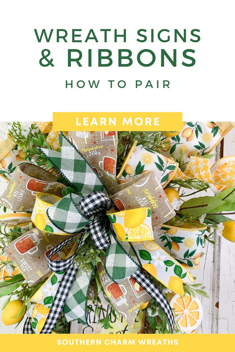
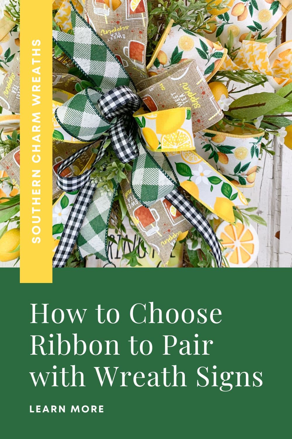
See It in Action: The Lemon Sweet Tea Wreath
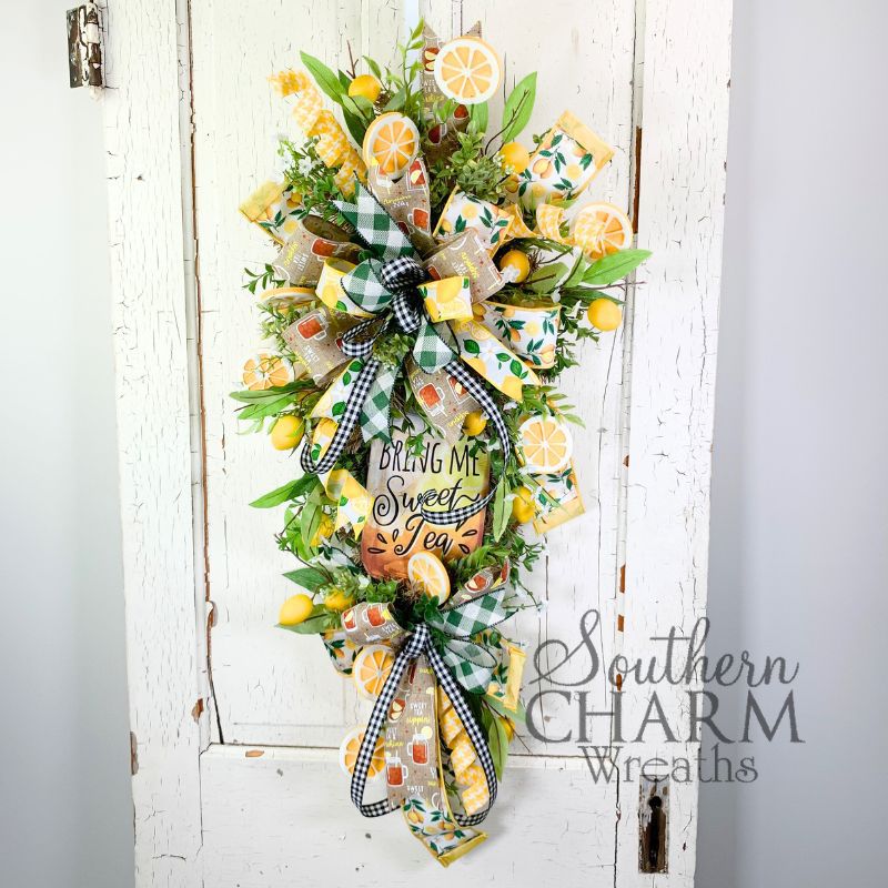
The bow in the photo above uses four ribbons, every single one pulled directly from the sign. Here is exactly how that decision was made:
Sign Breakdown: Lemon and Sweet Tea Sign
| What’s on the Sign | Ribbon Chosen | Why It Works |
|---|---|---|
| Yellow lemons, dominant color | Wide lemon-print ribbon | Anchor ribbon; mirrors the sign’s main motif |
| Burlap texture, sweet tea mugs | Burlap ribbon with sweet tea print | Picks up the sign’s texture and theme directly |
| Yellow as a recurring accent | Yellow houndstooth ribbon | Keeps yellow in the bow without repeating the lemon print |
| Neutral needed to ground bright colors | Black and white buffalo check | Grounds the palette and adds classic farmhouse contrast |
A Few More Things Worth Knowing
The sign is the star, the ribbon is the supporting cast. Everything in the bow exists to draw attention to the sign, not compete with it. If you step back and the bow is the first thing you see instead of the sign, the bow has too much going on. Pull it back by removing one pattern ribbon or swapping a bright ribbon for a neutral.
Vary the widths, not just the patterns. Four ribbons all cut the same width disappear into each other in the bow. A wide anchor, a medium supporting ribbon, a slightly narrower accent, and a narrow pop of color or texture. The width variation is what keeps all four readable in the finished design.
Texture counts as much as color. A burlap ribbon and a satin ribbon in the same color look completely different in a bow. Mixing textures like wired grosgrain, burlap, velvet, linen adds the visual richness that makes a bow look handcrafted rather than assembled. The sign’s material often hints at the right texture: a rustic wood sign calls for burlap and cotton, a painted metal sign can handle something shinier.
🎀 Quiz: What’s Your Ribbon Pairing Style?
Curious how you naturally approach ribbon selection? Answer three quick questions and we’ll tell you your ribbon pairing personality — plus Julie’s tip for making your style work even better!
Q1: When you walk into the ribbon aisle, what do you do first?
Q2: How many ribbon patterns feel comfortable in one bow?
Q3: What’s your biggest ribbon frustration?
Quick Answers
How do you pick ribbon that matches a wreath sign?
Find the dominant color in your sign and choose your widest anchor ribbon in that color or pattern. Pull two or three supporting colors from the sign’s details and find ribbon patterns that match the sign’s overall style. Finish with a neutral ribbon like burlap or buffalo check to ground the combination.
How many ribbons should I use with a wreath sign?
Three to four is the sweet spot. One wide anchor ribbon in the dominant color, two mid-width ribbons in supporting colors or patterns from the sign, and one narrow neutral to ground the combination. More than five ribbons in one bow tends to compete with the sign rather than complement it.
Should ribbon match the wreath sign exactly?
No — and it should not! Ribbon that is an exact copy of the sign looks flat and redundant. The goal is coordination, not matching. Pull the same color family but choose different patterns and textures. A lemon-print ribbon next to a lemon sign works because they share a theme without being identical.
What is an anchor ribbon in a wreath bow?
The anchor ribbon is the widest ribbon in your bow — the one that carries the most visual weight and sets the color direction for everything else. It is pulled from the dominant color in your wreath sign and all other ribbons coordinate with it rather than competing with it.
What ribbon goes well with a farmhouse-style wreath sign?
Buffalo check in black and white or green and white, gingham check, a solid ribbon in the sign’s lettering color, and natural burlap are all strong choices. Keep the palette grounded in neutrals with one or two color accents pulled directly from the sign’s text or border detail.

Does Choosing The Right Colors For Silk Flower Designs Leave You Confused and Frustrated?
That’s right, in just a few hours you’ll go from confused and ready to throw out the glue gun, to a seasoned designer worthy of recognition!
Take the Color Clarity Masterclass!