How to Use Color Theory in Floral Design
At Wreath Makers Live in 2023, I spoke about color theory in floral design. Color theory is the foundation that guides the use of color in art and design. It involves understanding the color wheel, how colors mix (primary, secondary, and tertiary colors), and the relationships between different colors (like complementary and analogous).
In this post, we’ll explore the basics of color theory and how it can be applied to enhance your floral designs. Whether you’re a beginner or an experienced designer, these insights will help you create arrangements that not only look stunning but also convey the right emotions for any occasion.
If you want to dive deeper into mastering these techniques, our Color Clarity Masterclass is the perfect next step.
What is Color Theory?
Color theory is the study of how colors mix, match, and contrast. It’s based on the color wheel—a tool that helps us see the relationships between different colors.
In floral design, color theory helps you choose color combinations that work well together, whether you’re looking to create contrast, harmony, or unity in your arrangements.
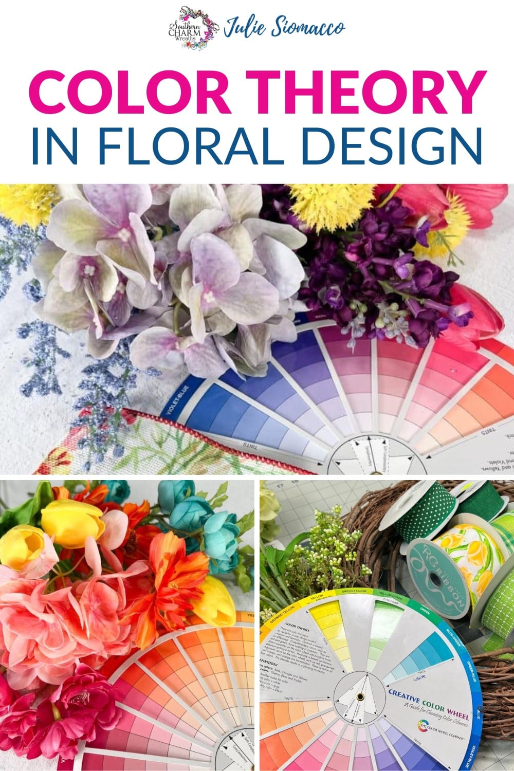
The Color Wheel
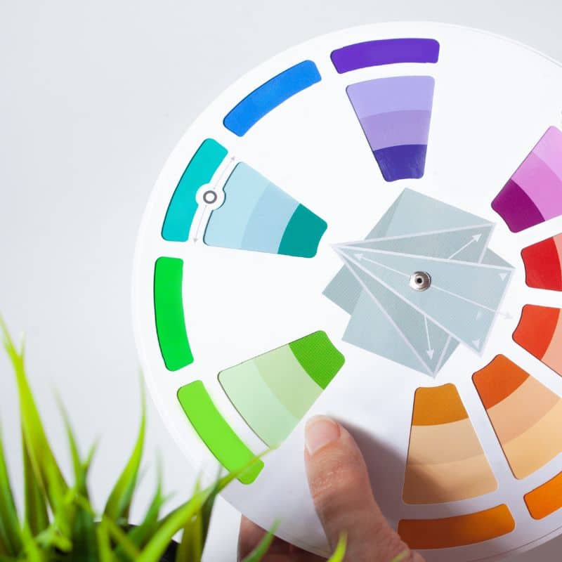
The color wheel is a visual representation of colors arranged according to their chromatic relationship. Primary colors (red, blue, yellow) are the foundation, and when mixed, they create secondary colors (green, orange, purple). Tertiary colors are created by mixing primary and secondary colors.
Color Psychology
While color theory is about the mechanics of color, color psychology relates to the emotional and psychological effects that colors have on people.
For instance, red can evoke feelings of excitement and passion, while blue is often associated with calmness and serenity. Understanding color psychology allows you to choose colors that not only look good together but also convey the right mood or message in your floral designs.
Color Harmony
Color harmony refers to the relationship of colors in a design. It’s the art of combining colors in a way that is aesthetically pleasing and creates a sense of balance. Using principles from both color theory and color psychology, color harmony ensures that the colors in your floral arrangement work together cohesively, enhancing the overall impact.
Whether you’re going for a subtle, serene palette or a bold, dramatic statement, achieving color harmony is key to creating beautiful and effective designs.
How They Work Together
In floral design, these three concepts come together to help you create arrangements that are not only visually stunning but also emotionally impactful.
Color theory provides the tools, color psychology gives you the emotional context, and color harmony ensures that everything comes together beautifully. Understanding these differences allows you to make more informed choices in your designs, whether you’re working on a small bouquet or a large-scale event installation.
Applying Color Theory in Floral Design
With a solid understanding of color theory, you can start applying it to your floral designs. The key is to use the color wheel as a guide to select colors that complement each other and create the desired visual effect.
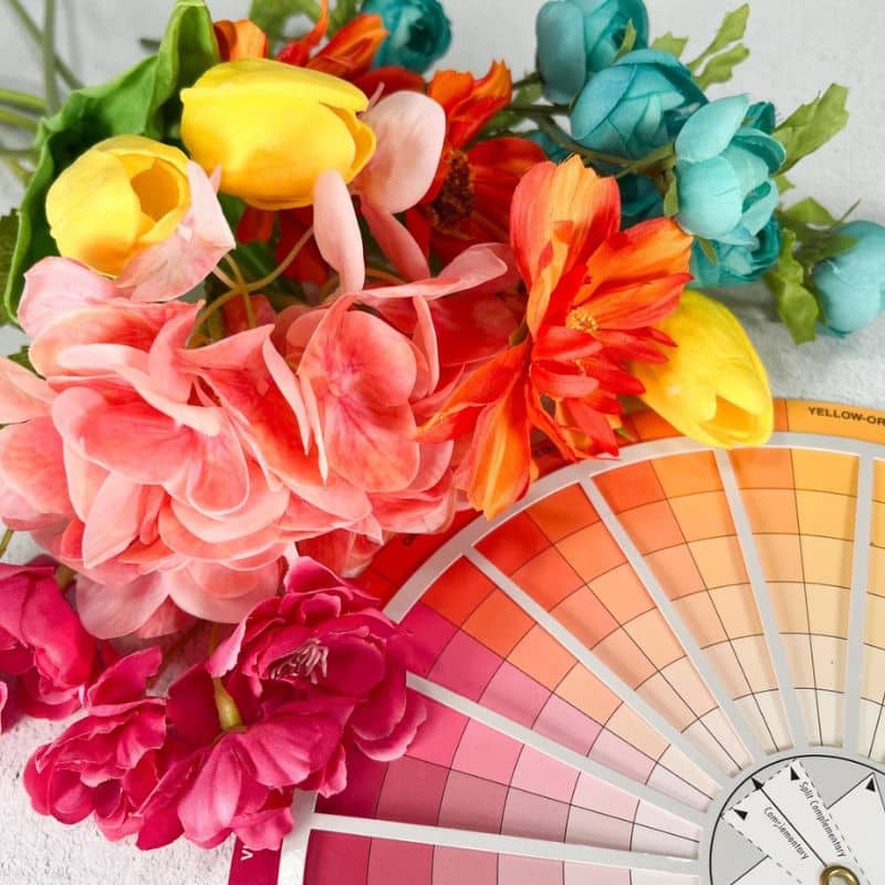
Choosing the Right Color Combinations
Depending on the occasion and the mood you want to evoke, you can choose color combinations that align with your vision. For example, a wedding arrangement might use analogous colors like soft pinks and peaches for a romantic feel, while a bold centerpiece might employ complementary colors like purple and yellow.
Creating Balance in Your Designs
Using color theory, you can ensure that your floral arrangements are well-balanced. This might mean using a dominant color as the base and adding accents with complementary or analogous colors to create depth and interest.
Examples of Color Theory in Action
In the Color Clarity Masterclass, we break down real-world examples of how color theory has been applied to create successful floral designs. These case studies show how different color combinations can be used to achieve specific looks and moods.
Understanding Color Harmony
Color harmony is the art of combining colors in a way that’s pleasing to the eye. It’s about finding the right balance between colors to create a cohesive and visually appealing design.
Why Color Harmony Matters
When colors are in harmony, they work together to create a sense of unity in your design. This doesn’t mean all the colors have to be the same or even similar; it’s about how they complement each other and contribute to the overall look.
Types of Color Harmonies
There are several different types of color harmonies you can use in your floral designs:
- Monochromatic: Using different shades of the same color creates a harmonious and elegant look.
- Complementary: Combining colors that are opposite each other on the color wheel creates a striking contrast that draws the eye.
- Analogous: Using colors that are next to each other on the color wheel produces a cohesive and serene design.
Applying Color Harmony in Your Floral Designs
To achieve color harmony, consider the overall effect you want to create. For a calming and understated arrangement, you might choose a monochromatic or analogous color scheme. For something more dynamic and attention-grabbing, a complementary scheme could be the way to go.
Practical Tips for Using Color Theory and Color Harmony in Floral Design
Now that you have a foundation in color theory and color harmony, here are some practical tips to help you apply these concepts to your floral designs:
Start Simple
If you’re new to working with color theory, start with a simple color scheme. A monochromatic or analogous palette can be a good starting point.
Experiment with Contrast
Don’t be afraid to experiment with complementary colors. They can create bold, dynamic designs that stand out.
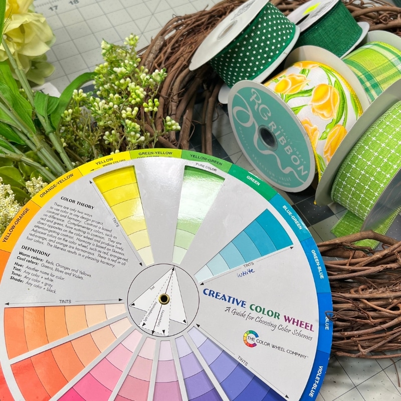
Use the Color Wheel as a Tool
Keep a color wheel handy when planning your designs. It’s a helpful reference for ensuring that the colors you choose will work well together.
Avoid Common Pitfalls
One common mistake is using too many colors in a single arrangement, which can make it look chaotic. Stick to a few carefully chosen colors to create a more cohesive design.
Advanced Techniques
For those with more experience, consider layering colors to create depth, or using unexpected color combinations to add a creative twist to your designs.
Understanding the power of color is essential in floral design. Learning the principles of color theory and color harmony can take your arrangements to the next level. By applying these concepts, you can create designs that are not only beautiful but also balanced and impactful.
If you’re eager to learn more about how to use color effectively in your designs, our Color Clarity Masterclass is made for you. In the masterclass, we’ll go beyond the basics, exploring advanced techniques and offering hands-on guidance to help you master the art of color in floral design.

So helpful
Thank you